MDLIVE Mobile Application Redesign
MDLIVE is a tele-health provider and using their service a user can directly talk to a doctor and avoid longer doctor office’s wait time for non-urgent concerns with much lower cost and convenience from their home. Their product is widely used across United States by direct consumers, but they lacked the acceptable presence in mobile world. So building a more modern and intuitive iOS and Android app became a necessity
My Role and Responsibilities
When MDLIVE started their mobile application redesign initiative I was hired at 2016 as the first designer to take along the mobile redesign process for both iOS and Android platforms. I was responsible for leading the mobile product design lifecycle from ideation to implementation, working closely with iOS and Android Product managers and engineers to shape up the application till their first release on 2017. In the timeline of almost an year, I helped the team to grow by hiring 2 other UX/UI Designers in the team, mentoring one of the fresh UI designer, bringing in latest tools and technologies to collaborate faster and established a refreshed visual language by building a comprehensive design library
Timeline: May 2016-May2017 , Platform: iOS and Android Mobile
Problem with the Old MDLIVE iOS App
Their website turned to mobile app, lacks a consistent navigation, not compliance with mobile specific design principles and thus very hard to use, specially with the long forms. Interacting with the content and moving through the system is confusing and inefficient. It also has a dated visual design, lacks a consistent color, iconography and typography that reflect strong brand valuation
Design Process: Research
Understanding Users:
The initial research done by an external agency named Pointclear with a series of direct interviews and a focus group study for both their consumer and provider side. Their report gave us a good idea of 3 different persona and demographics to target our app for

Report by Pointclear
Competitor Landscape:
Amwell was their direct competitor and already having well established presence in the mobile world. Some of the users in the research participation group expressed their preference over Amwell. Telehealth was an emerging service and other apps, such as Dr On Demand, Healthtap, Teledoc were also emerging as newer players in the domain
Design Process: Information Architecture
As a next step I created an updated information architecture to represent the App’s blueprint

Design Process: UX Flow / Journey Maps
The main goal of this app is to provide the easiest experience for a user to see a doctor, minimizing the necessary steps to comply with the medical t&c. Also, giving the users option to find their own provider was also important. After few iterations, we came up with the following UX Flow where they will be able to see a doctor on demand or search the doctors prior , the necessary Q&A will be interactive and reduced in number
UX Flow for Scheduling with a Doctor
Wireframe and Screen Flow
After confirming an agreed upon flow, I spend some time making low and high fidelity wireframes to present to the stakeholders and iterated on these. We initially spent more time on wireframing as we were also working on establishing a color palette, branding and updated visual system side by side on this. Until the new visuals established, it was hard to create hi-fidelity mockups just yet
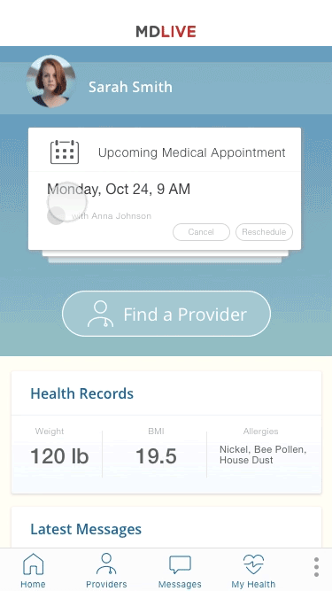
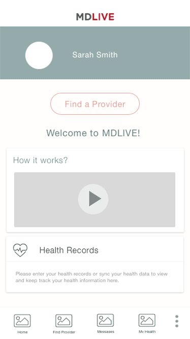
Login and Home Dashboard
Scheduling Flow
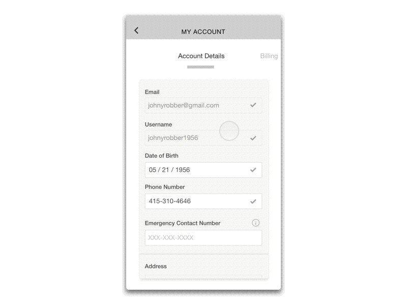
My Account and Settings
Micro-interactions
In the next step in the design process I wanted to define modern gestures and micro interaction pattern for various scenarios, as doing that early on gave our developers some time to estimate the time it would take to implement these
Visual Design - iOS and Android